Delivering Short-form News - Hulu, Living Room Platform
Role
I contributed to the discovery, ideation, prototyping, usability testing, synthesis, and final deliverables. I helped our team define and reach sprint milestones.
Project Team
This project was done in collaboration with Product, Design, Research, and TPM interns.
Duration
This project took around 5 weeks to complete. We presented our deliverables to the Product & Design leadership team.
Goals
Design a Living Room experience that shows relevant and trending news clips to Hulu users in an efficient manner.
Figure out the best way to show short-form news based on trends and viewer preferences
Outcome
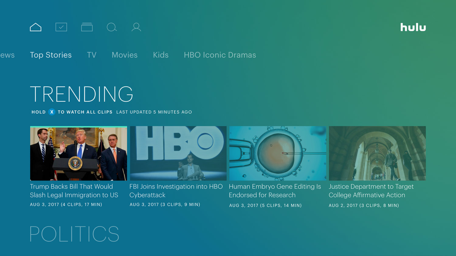
The “Top Stories” collection gives viewers a way to browse news clips by category. Viewers can choose to watch entire playlists or individual clips. We also visualized ways for Hulu to add news personalization into the Living Room onboarding flow.
Problem · No Access to Short-form News
News consumption behaviors have changed rapidly over the past decade. Nowadays, many people prefer to get their news from online sources instead of newspapers and live broadcasts. There is a higher demand for short news clips over more traditional mediums like print. Many people do not have the patience or free time to watch hour-long cable news broadcasts anymore. People like news clips because they can feel caught up in a short amount of time.
Through analyzing our subscriber data, we learned that "News" is the most watched short-form genre on Hulu. "News" is also the most popular genre of Live content. Subscribers tune into news broadcasts the most from their Living Room devices (Apple TV, Roku, Smart TV, etc). The second preferred platform is Mobile (phone or tablet). Hulu actually has an enormous amount of short-form news on its website but the content can only be accessed with a desktop browser.
Our team was asked to design an experience for people to discover and watch short-form news clips through Hulu’s Living Room app.
Outcomes
Top Stories News Collection
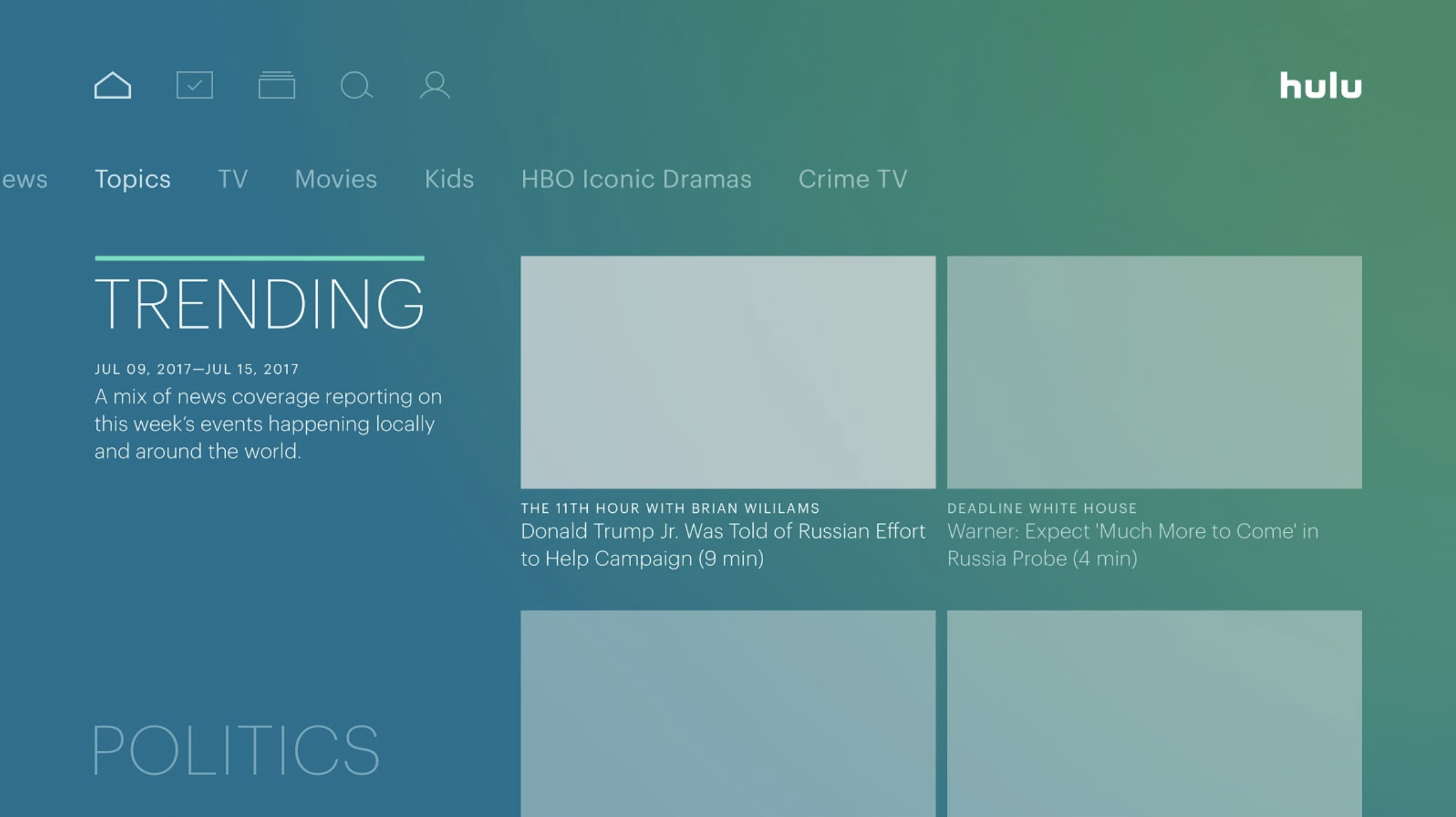
Based on our competitive analysis and usability findings, our team pitched the concept of having a dedicated “Top Stories” collection on the homepage for browsing short-form news clips. With this design, viewers can quickly see what’s trending generally or by category (ex: Politics, Sports, etc). Each tile offers an auto-grouped playlist of clips to watch. For a “lean back” experience, viewers can hit play and let the clips rotate through in an autoplay mode.
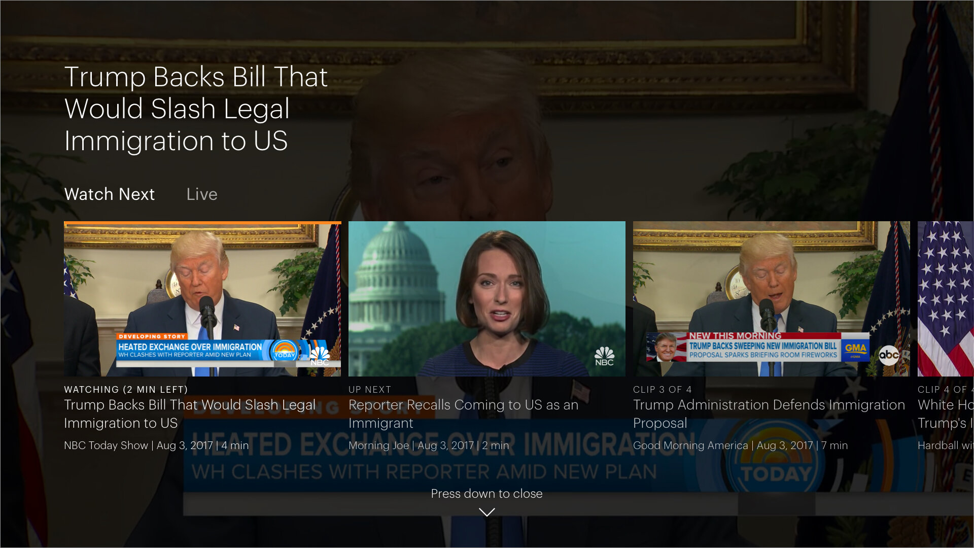
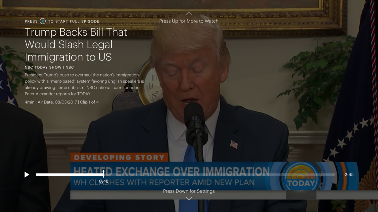
Playlists of Short-form News
Once in the playback experience, viewers have the option of jumping between clips that interest them in the group. We learned that when browsing on the homepage, people are not overly concerned to see what network the clip is from. However, in this view, they may want to more closely inspect all of the metadata details concerning the date created, length, network, etc. We also made sure to provide easy access to the Live broadcast of the news network.
Process
Literature Review
As a team, we wanted to understand the news space both at Hulu and the market at large. We analyzed internal Hulu surveys and documents in order to better understand our users. We also looked outside of Hulu for inspiration and trends within the news market. We read articles, publications, and studies to learn about changing news habits. We learned that people catch up on the news when it's most convenient for them. The activity is becoming largely time-independent. Most people don't sit around and wait for a televised news broadcast anymore. When an event happens, they'll find a way to learn about it through a number of different channels. Older audiences are apprehensive about getting the news from social media platforms like Facebook and Twitter, however. Young people are notified about current events through multiple sources.
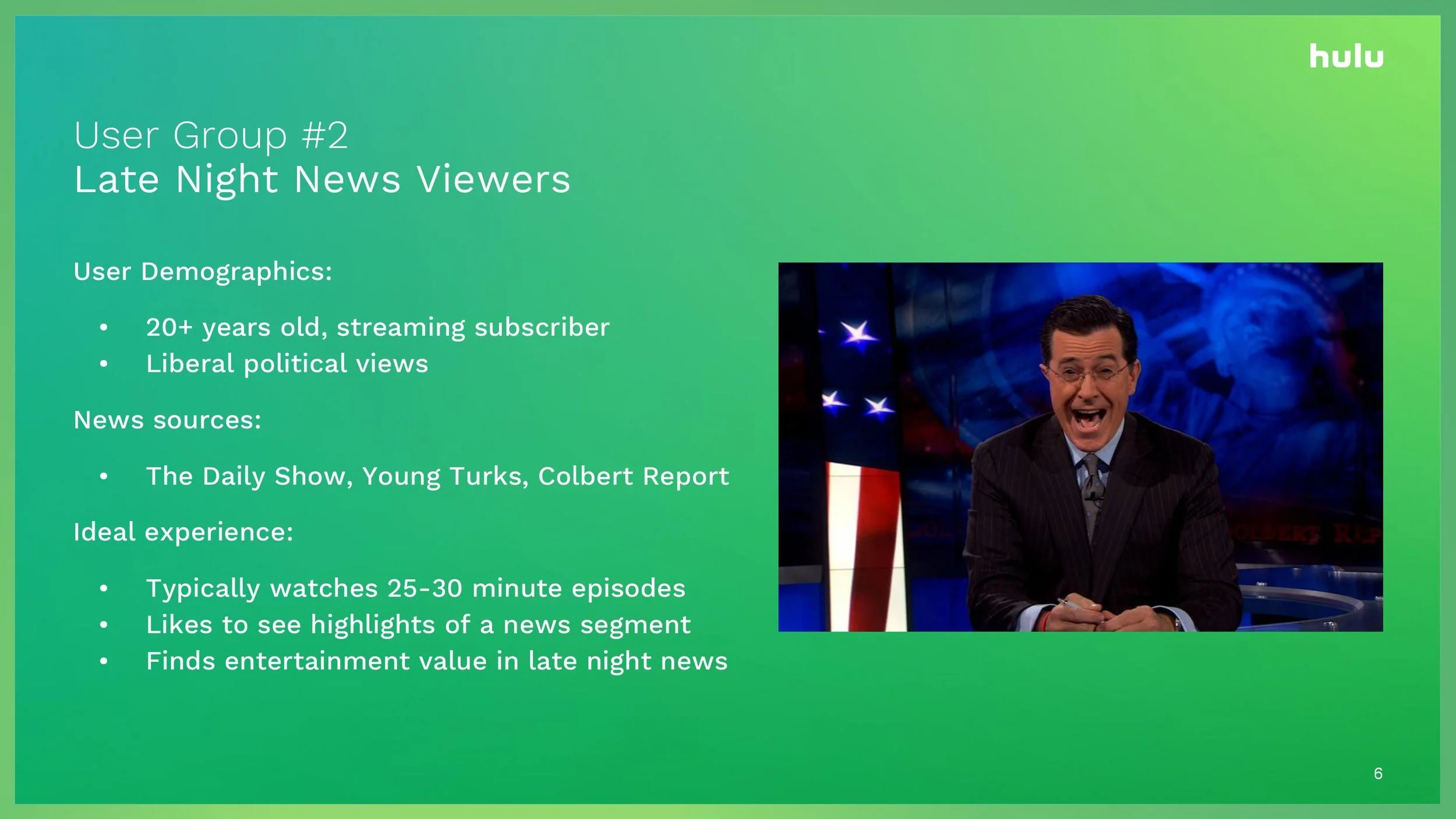
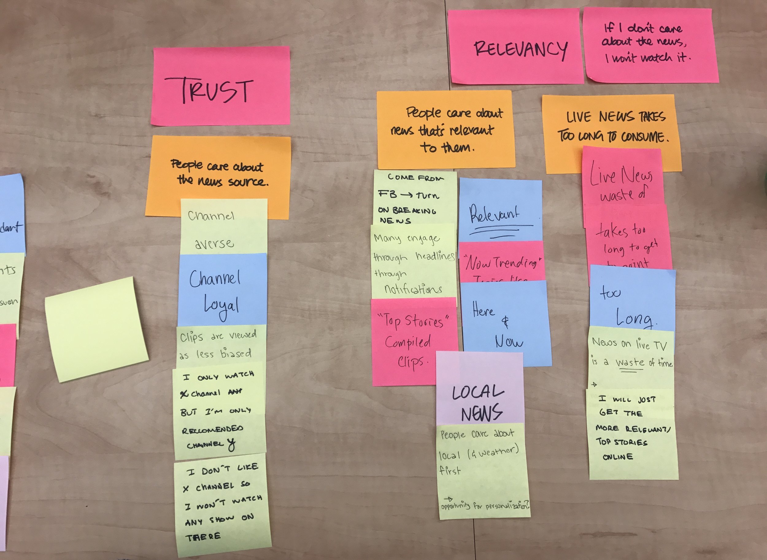
Focusing on video news has become advantageous for its perceived credibility. People are very skeptical about what they read on paper and online today. Therefore, they are more trusting of news clips and video footage. People want more choice and variation in the sourcing of their news as a result of this. It's important to note that people are very channel loyal in getting their news updates. They gravitate to the sources that they trust. Lastly, we learned that most people care about the "here and now" when getting caught up on the news. People care the most about the local news, weather, and breaking news updates. Late-night talk shows are notably popular amount our Hulu subscribers.
Examining Motivations
We thought about where and how people might want to access short-form news. What settings might they be in and what devices would they use? This was an important exercise for our group to do, given that the design would be ultimately shaped by these factors and their limitations. We brainstormed a list of questions to keep in mind as we started thinking about approaches to the project. What would a "Trending News" collection look like within a Living Room experience? Do people care to get personalized news content? How do we design a news experience that speaks to different demographics? After drawing up these questions, we mapped out all the possible touchpoints in the current Hulu experience to see where short-form news might fit in. How might onboarding be of relevance to this project, for example? What could appear in My Stuff or Browse?
Competitive Analysis
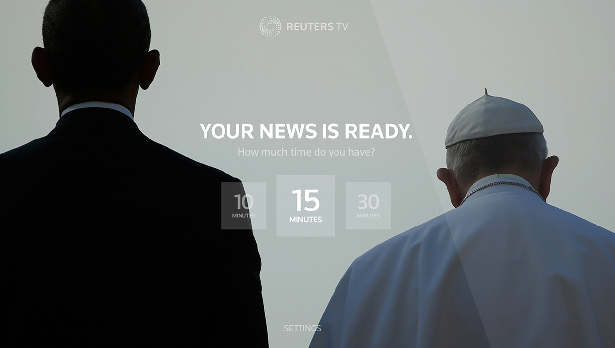
In assisting with the research, I spent time testing popular news experiences on XBOX and Apple TV. I also looked into how certain news websites and mobile apps display short-form news content (ex: YoutubeTV, New York Times). I found a number of patterns across these experiences. The clips were generally not grouped by topic. Almost every app that I tried followed similar naming conventions (Top Stories, Latest News and Live content). The preview for the clips only ever contained a thumbnail image and headline.
Details about the clip were almost never shown upfront. The headlines were enough to pull people in. The best experiences were the ones that compiled short playlists for the user to start watching. This allows for a lean back experience where the user doesn't have to interact much with the system.
Affinity Diagram
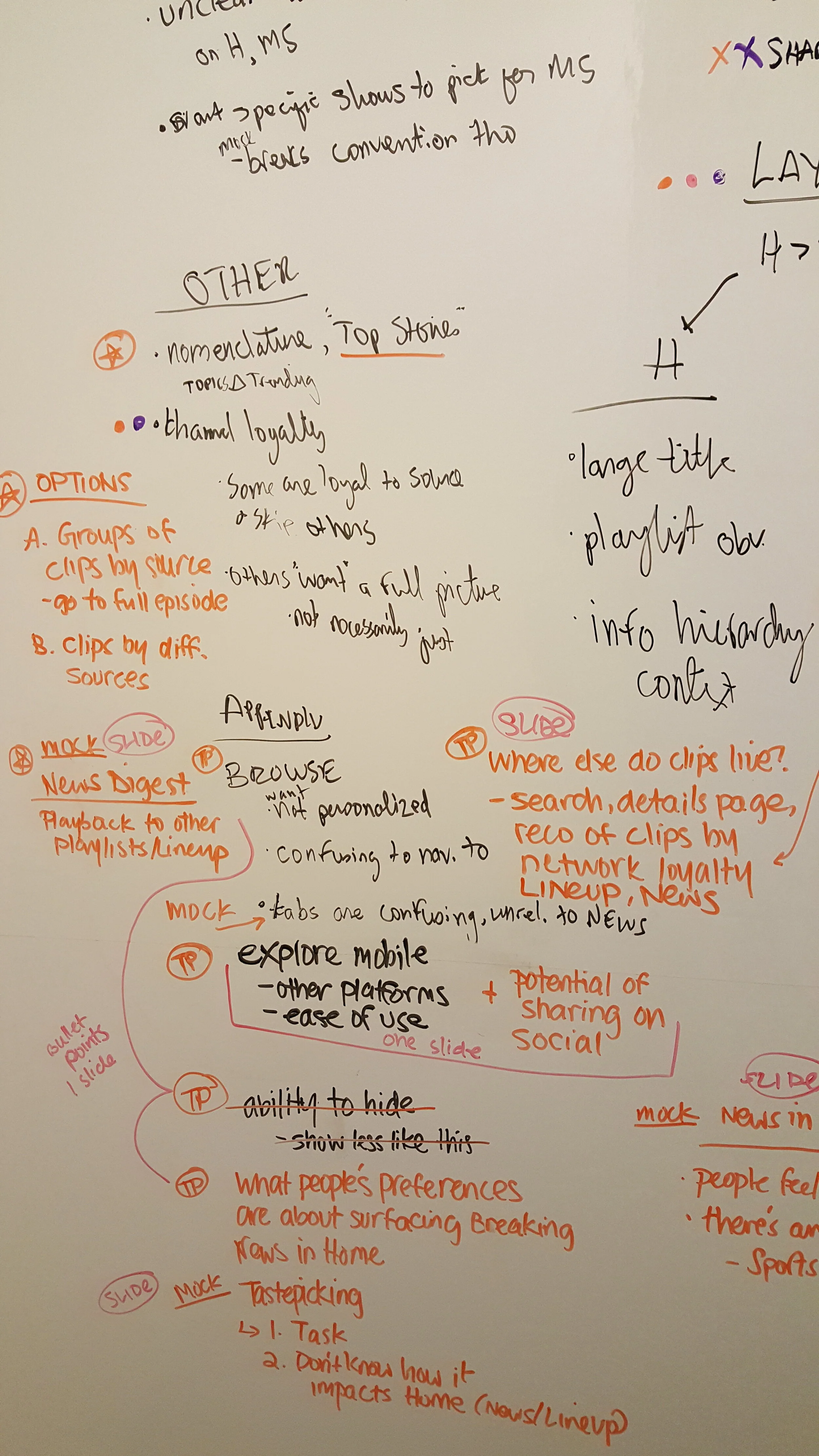
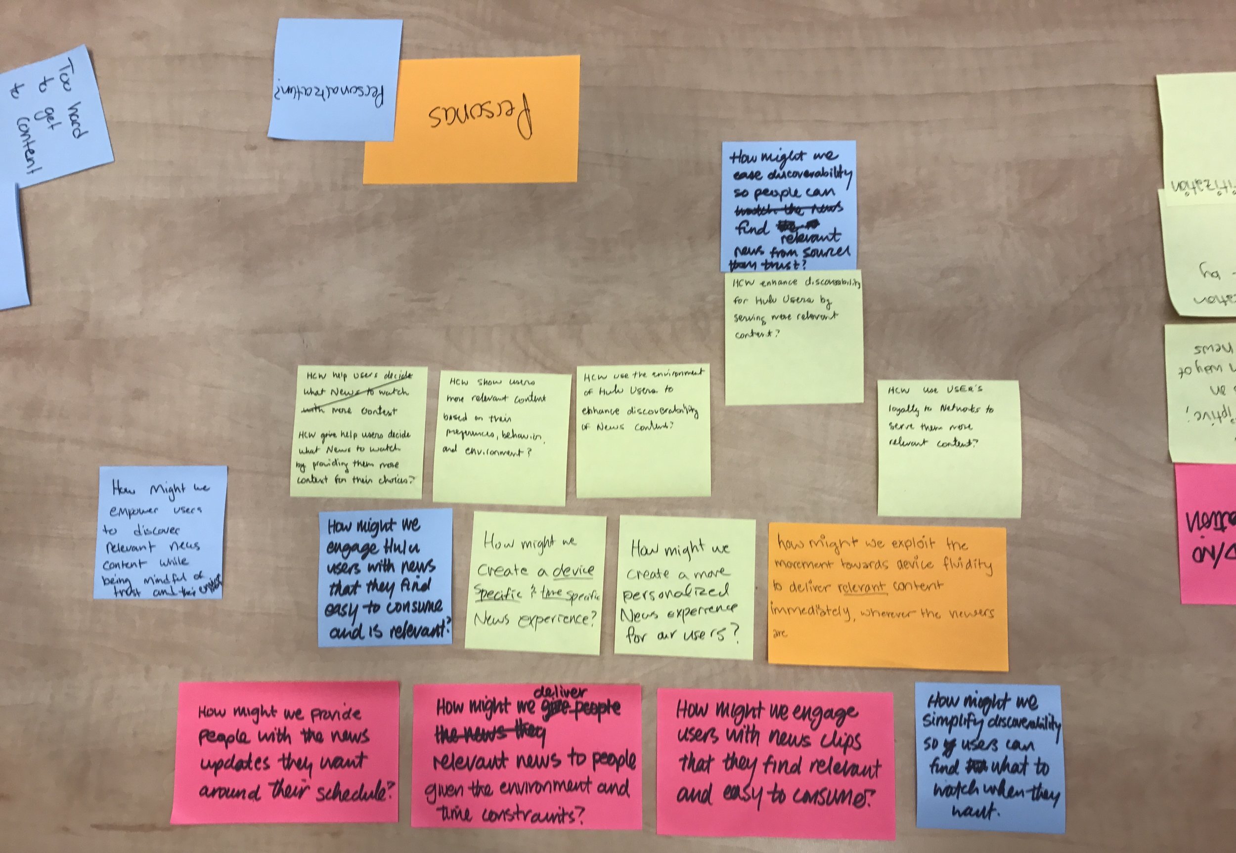
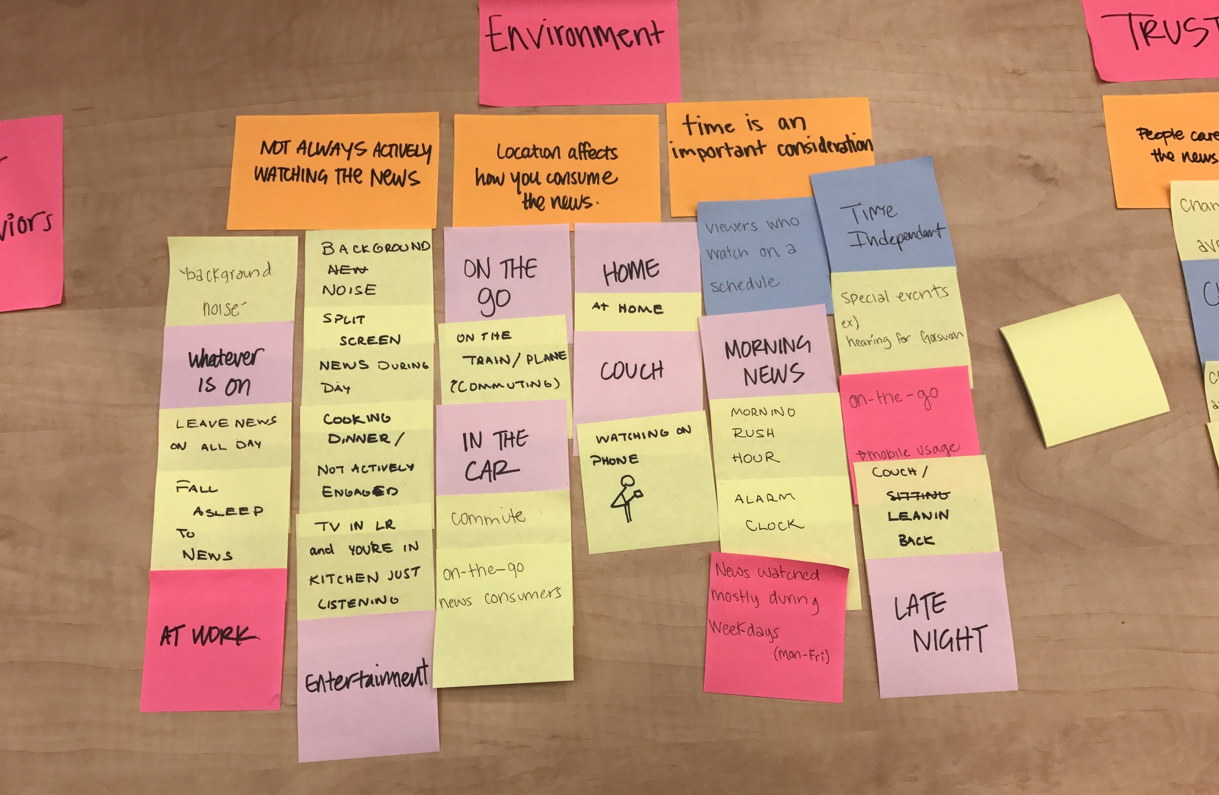
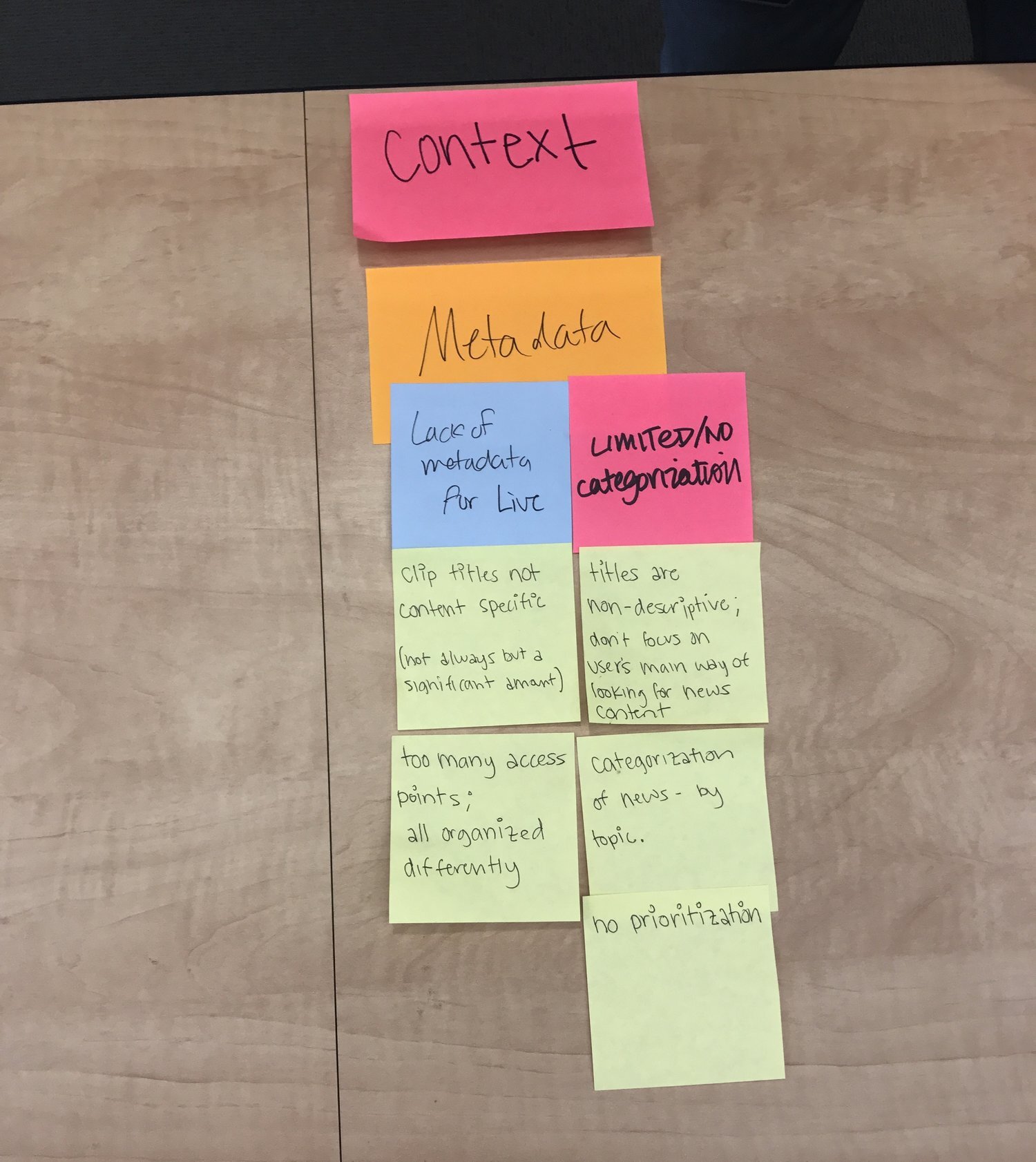
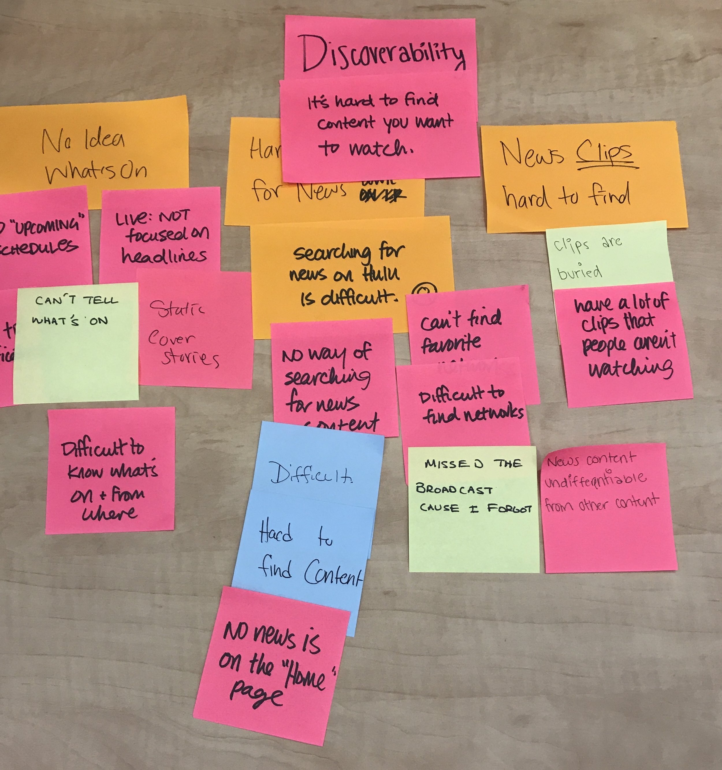
We collaboratively made an affinity diagram to make sense of our research. Grouping the Post-its helped us identify high-level concepts to focus on heading into designs: Context, Relevancy, Trust, Discoverability, and Environment. Doing this exercise helped us think of new questions to consider. For example, how might we create a more personalized News experience? How might we provide news updates for people around their schedules and free time?
From brief interviews done with different people in the office, we learned that many people like to play the news in the morning as they're getting ready for work. How might we create a lean back experience for people who do not want to sit by the TV and actively watch the news? With these questions in mind, we set out to make some initial designs.

Explorations
Personalization in Onboarding
At the start, our team was interested in exploring ways to bring personalization elements into the experience. We sketched out quick wireframes on paper first before translating them into low fidelity mocks. We thought of different ways people could subscribe to news categories when onboarding to the Living Room experience. One exploration looked at a visual approach while another relied on text only. Based on our research, we felt like it was important to give people a way to tell Hulu what sort of news they care about specifically so that the clips shown would be relevant to them. If they didn’t care to see sports highlights and that is what surfaced to them first, that would not be a great experience.
Improving News in “My Stuff”
We spent time navigating through Hulu’s Living Room app to see how the current News experience could be improved. In looking at the “My Stuff” section, we noticed that news shows and live broadcasts get grouped under TV shows even though they were added from the specific “News” area on Home. Having a separate section for News content would reduce clutter and help people get to what they want to watch more quickly. To further improve organization and scannability, we suggested having clear sections to help differentiate the types of news content in My Stuff (ex: Latest vs. Local).
Improving the Browse Experience
At the bottom of the News section on Home, a CTA appears at the top of a fairly blank page. We pointed out to the larger design team that this space could be better utilized. Hulu could surface more content in rows rather than having people click in as an extra step. Once we entered into the News collection, we saw that the navigation at the top lacked personalization. What if people’s favorite news networks and topics could be pinned at the top (ex: CNN, Politics, Local)? We thought about adding a way for people to subscribe to topics through the details page of a news show.
Dedicated Space for News Clips
In our explorations, we chose to place news clips in their own collection, called “Topics”, rather than together with long-form news. Providing a dedicated space for clips would help people reach that content, in particular, more quickly and reduce confusion between the two types of news. Our team heavily debated if the news clips should be grouped by category or by topic. One option gives people news updates under a broad category (ex: Political Digest) while the other provides a focused playlist of clips tied to a single issue (ex: Health Care Bill). Which method of grouping would people prefer?
Exploring Different Layouts
We made various iterations of the layout and design to test for user preference. We did not know how much people cared to read clip descriptions in the preview. Most of the competitive experiences surfaced headlines with barely any descriptions. We also saw that playlists of clips were generally shown in a horizontal manner. We tried some designs where the clips appeared in columns since the rest of the Hulu interface relies on up and down scrolling. When we showed our concepts to other designers for feedback, they pointed out that the two-column, vertical layout would be challenging to navigate for many people on the Living Room platform.
Some of the designs we made introduced features that would allow people to get updates on developing stories. They could save interesting topics to "My Stuff". For example, if they followed the "Health Care Bill" topic, new content would automatically be saved for them to watch later. We were not sure if people would expect or want to receive updates on stories from time to time. We tested this idea, along with the others, to see which directions we should go in.
Usability Testing
Think Aloud & Paper Prototypes
To help us move forward, we conducted user studies in the research lab at Hulu’s HQ for two days. We worked with the UX Research intern to design a test plan. Together, we outlined test goals and high-level questions. We chose to test with paper prototypes over digital mockups because we knew we could get more candid feedback that way from participants. We did not want them to hold off on critiquing our work because it might look like it's in a polished or finished state. Getting to observe and help with the user studies was a valuable experience. While Lauren walked the participants through the tasks, we took notes on the other side. We transcribed the interviews, detailing people's preferences for personalization, layout, navigation, and more.
Identifying Patterns
We discussed the preferences people shared during the research study and thought of ways to include their suggestions in the final iterations. We came out of user testing with a strong understanding for what people wanted in the designs. Many of the questions we had concerning layout, navigation, and personalization got answered through the study. At the end of each day, Lauren sent us a research output that summarized the key-takeaways we gained from doing the study. Her notes helped us significantly in our process of designing the final explorations.
Learnings
Incorporating Findings
We considered and incorporated many of these key takeaways into our final design iterations. People liked having the news clips separated from the long-form content as we had predicted. The use of the word "Topics" confused participants. They didn't expect to see news clips under the label of "Topics". People responded a lot better to seeing news content under the title of "Top Stories".
Participants strongly preferred browsing news clips grouped by categories instead of topics. We went ahead with using categories like Trending, Politics, Business, Entertainment, and Sports in our designs. They wanted to be in control of choosing what content to watch. They didn’t like the idea of being shown a specific playlist upfront because it felt too much like the system was making the decision of what to watch.
They found the vertical designs confusing to scan and navigate so we stuck with the horizontal layout. We also learned that out of all the information shown, people care the most about the headlines. We chose to leave out the description and source in the preview to keep the focus on the content itself as people browse. The clip’s full description would be accessible in the playback experience.
Reflections
In the span of five weeks, we developed and tested a vision for serving short-form news content on Hulu. From the start, we knew this project would be largely self-directed. As a small group of interns, we held each other accountable for our assigned responsibilities. We balanced working independently and collaboratively on various tasks, supporting each other along the way when needed. It was a pleasure getting to work closely with members of the Product, Design, and Research team. I deepened my design, research, and management skills throughout this project. It was a super memorable experience.
For the 2018 Winter Olympics, Hulu did launch a way for viewers to personalize their news coverage in ways that are similar to our project. Engadget shares that “…Hulu will let [Live TV subscribers] pick which Olympic sports they're most interested in…Users selecting luge and freestyle skiing as their favorites will see coverage of those events appear up top in the Olympic Winter Games section of the Hulu UI. They'll also see replays, highlights and athlete profiles surfaced”.


