Audio Description & Player Settings - Hulu, Web Platform
Role
As the lead designer, I was responsible for the initial research, competitive audit, explorations, mockups, prototypes, technical specs, and QA. I collaborated closely with developers based in the Beijing office.
Project Team
This project was a cross-team effort between Product, Design, Tech, TPM, Viewer Support, Copy, and Legal.
Duration
This project took around 3 months to complete and launched in early 2019.
Goals
Determine where and how someone should enable the “English - Audio Description” track within player settings.
Decide where and how the Audio Description genre page should appear on the website.
Outcome
People can now browse for audio-described content in a dedicated hub and enable the track from within the player. I also used this project as an opportunity to redesign the settings menu interface entirely.
🔗Press: ACB, Cord Cutter News, Business Insider
What is Audio Description?
“Audio Description involves the accessibility of the visual images of theater, television, movies, and other art forms for people who are blind, have low vision, or who are otherwise visually impaired. It is a narration service (provided at no additional charge to the patron) that attempts to describe what the sighted person takes for granted -- those images that a person who is blind or visually impaired formerly could only experience through the whispered asides from a sighted companion.” - American Council for the Blind
“Approximately 12 million people 40 years and over in the United States have vision impairment, including 1 million who are blind, 3 million who have vision impairment after correction, and 8 million who have vision impairment due to uncorrected refractive error.” — Centers for Disease Control and Prevention
Problem · No Audio Description on Hulu
Prior to the launch of this accessibility initiative, the Blind and Low Vision community had no way to find or enjoy content on any of Hulu’s platforms. Unlike Netflix and iTunes, Hulu had no dedicated page on its site for browsing Audio Description content.
Additionally, the player settings offered no “Audio Description” track setting. Shown below, the original menu design did not scale well across breakpoints and had no section for Audio languages. The visual design and grouping made the options difficult to distinguish.
The American Council for the Blind called on Hulu to promptly resolve these issues since millions were being impacted by the lack of accessibility features on the site.
The design and contents of Hulu’s player settings prior to this project.
Outcomes
Redesigned Menu & Audio Track Capabilities
The settings menu was redesigned to work more dynamically across all breakpoints. The menu can now support numerous languages. Most importantly, people now have the ability to switch audio tracks and choose “English - Audio Description”, within the menu which was not possible previously.
Browsable Audio Description Hub
Hulu added a dedicated page to house all of its audio-described content in one place, making it easier to browse all the different offerings, from shows to movies. The American Council for the Blind added a special section to its site highlighting the audio-described content on Hulu as well.
Process
Literature Review
In recognizing that we were not the target audience for this feature, I set aside time to learn about the history, uses and benefits of audio description. I hoped to better understand the community we were designing for and examine existing best practices. I read articles, forums, and lawsuits about audio description.
My research led me to the “Audio Description Project”, an informative resource managed by the American Council for the Blind. Visitors are able to learn which services provide Audio Description content and features. When I looked around the site, no section for Hulu existed just yet.
Competitive Analysis
Next, I checked out other streaming services to see if there were established patterns for where an audio description page might go and where the audio track option would be located in a settings menu. The audit consisted of Netflix, Prime Video, iTunes, Twitch, Facebook Watch, Youtube, YoutubeTV. I put my notes, screenshots, and video recordings into an InVision board to share with the team.
Enabling Audio Description Tracks
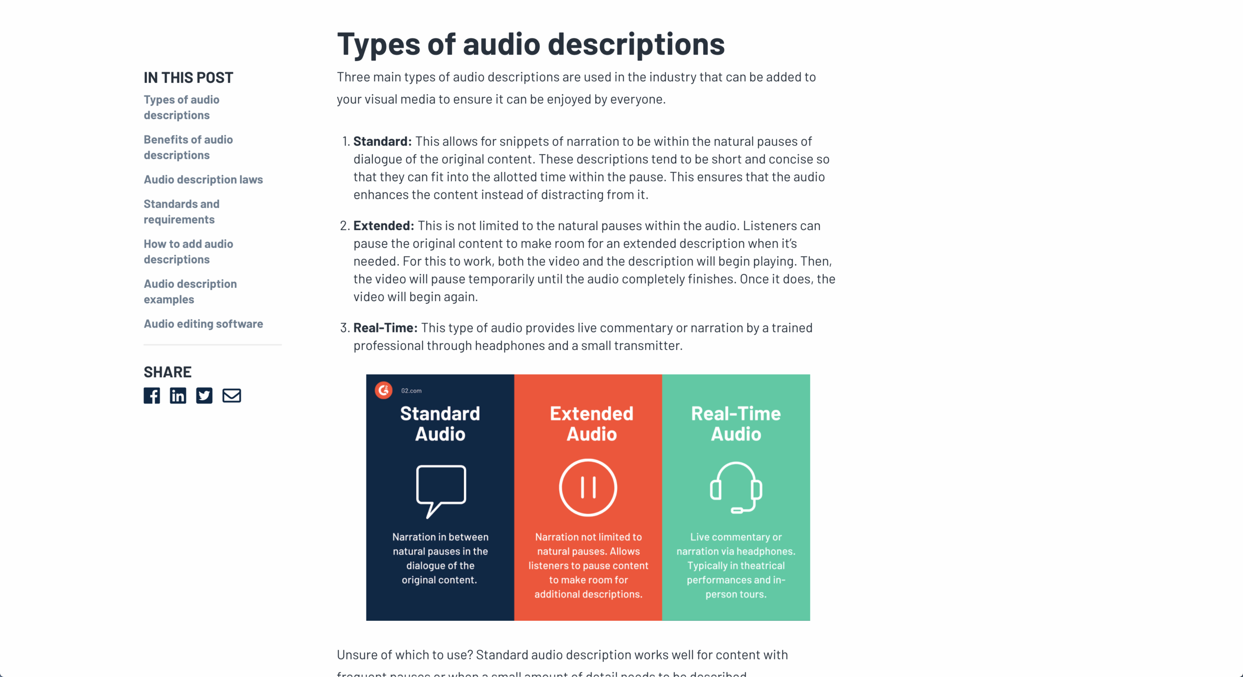
"English - Audio Description”typically appears after “English” in the Audio track list. This is expected given that most menus follow an A-Z format. To simplify navigation, some competitors separate the Video and Language settings from each other.
Locating Audio-Described Content
Netflix, Prime and iTunes offer dedicated pages or collection trays to make browsing easy. iTunes puts an “AD” badge on the details page of a show or movie to indicate that it includes an audio description track.
Proposal · Revamp Hulu’s Menu
The research helped our team make smarter and more informed decisions going forward. I had a better idea of how someone might go about finding and playing audio-described content. Doing the competitive analysis also helped me realize that our settings menu needed a complete refresh. In comparison to the other menus tested, Hulu’s looked antiquated and was disorienting to use.
Significant Cognitive Load
The layout, lack of hierarchy, all-caps headings and text wrapping made the menu difficult to scan. With all the options displayed at once, it took a while to locate the desired settings. Also, no option existed to switch Audio tracks.
Poor Scalability
The menu did not scale well across breakpoints and could only contain a certain amount of items. This could pose a problem in the future if Hulu chose to go international. The menu would not be able to support a long list of language options, for example.
The design and contents of Hulu’s player settings prior to this project.
Opportunity · Responsive Menus
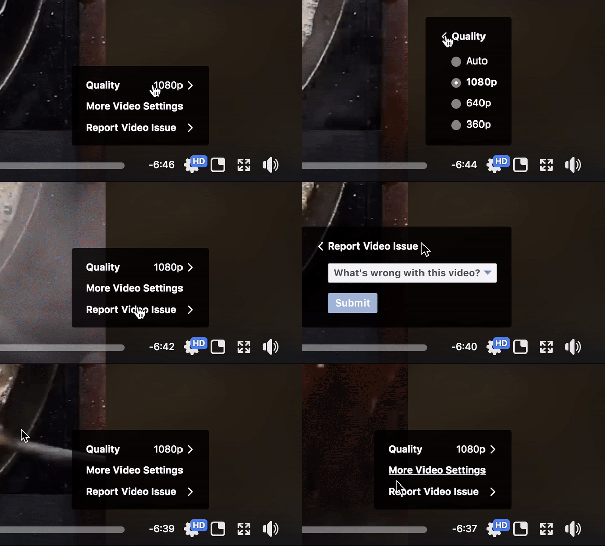
Youtube, Facebook Watch, and Twitch lay out their player settings in a responsive menu that adjusts in size based on the number of options displayed. Given that the submenus are scrollable, they can house as many items as needed. The design scales neatly across breakpoints and doesn’t take up any unnecessary space.
I presented the advantages of this layout back to the project team. We all agreed that moving away from the fixed panel design made sense in the short-term and long-run. Hypothetically, if Hulu went international and needed to support more languages in the future, the responsive menu would handle the additions smoothly.
Execution
Menu Explorations
Early iterations of the menu focused on improving text hierarchy and grouping methods. In a short amount of time, I created numerous mockups and prototypes with subtle modifications to present back to the team on a regular basis; these were done rapidly to simply illustrate high-level concepts in team check-ins. Comparing the slight changes in the iterations helped us settle on decisions at a gradual pace. The images below show only a tiny sample of the iterations made in the process.
Toggling Autoplay Settings
To simplify the menu and reduce barriers to the action, I suggested we turn the Autoplay setting into a toggle. From an ethical viewpoint, I did not want Autoplay to feel hidden within the menu. If someone wants to disable Autoplay, they should be able to do it without any trouble.
Grouping “Audio & Subtitles”
We chose to display “Audio Description” instead of “AD” to reduce confusion and make it easy to distinguish either by sight or screen reader. We chose to combine the “Audio & Subtitles” section together since we know that most people tend to adjust those settings at the same time.
Decisions & Directions
To keep within scope and development timelines, we aligned on having a singular menu to house both Video and Language settings, unlike Netflix where the two are separated. We quickly moved away from explorations that stuck with the horizontal panel design to a more vertical, space saving layout. The “Subtitles & Captions” and “Subtitles Language” sections merged together. We chose to give the “Subtitles and Audio” section only one entry point since the action results in bringing up a single submenu.
Throughout the design process, I had to consider how any changes made to the main menu would impact the submenus within and across breakpoints. Often times, I worked in a view where I could see the menus laid out side by side at different breakpoints, down to 320px. This way, I could keep track of edits and see where or how the layouts needed to condense down.
Project Documentation & QA
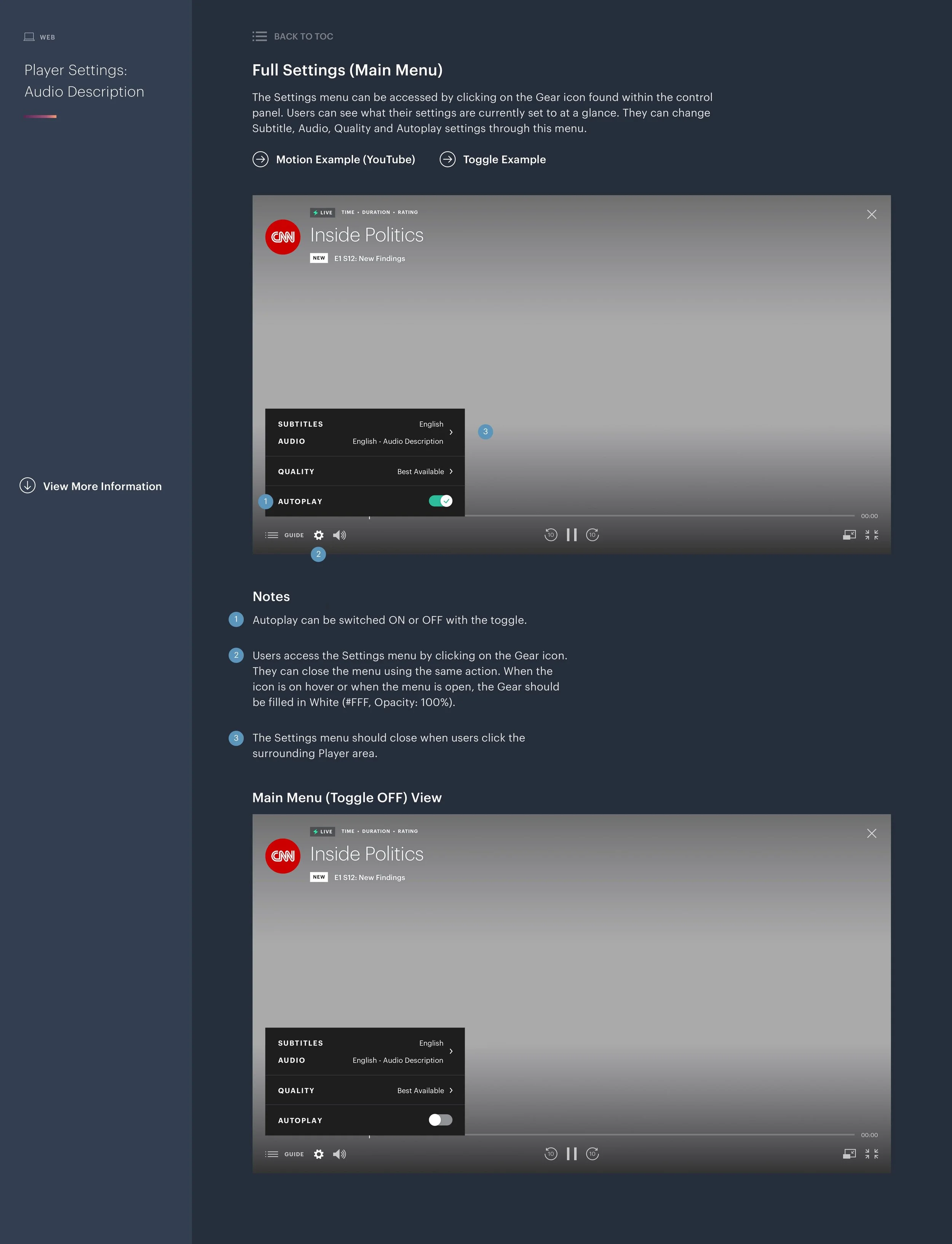
To wrap up the project, I created a set of detailed technical specs for the developers, describing how each part of the menu should be implemented. I made sure to include background context about the project for anyone who might look at the documentation from an unfamiliar perspective. I highlighted the user stories, critique of the current design, and competitive analysis findings at the start. The bulk of the documentation focuses on the component specs, design logic, interaction flows, clickable areas, etc. The specs were particularly lengthy due to the fact that these components were new and mostly done from scratch. At the time this was made, the component library was still a work in progress.
Whenever possible, I linked pages out to motion examples and prototype recordings to help the development team more easily visualize the desired transitions and animations. With the Web development team based in Beijing, we communicated back and forth on a daily basis over Slack, Box, and Jira to complete Design QA. We were able to get through the process pretty quickly in this way.
Launched Design
Although I’m already itching to make improvements to this design, it’s a huge leap forward in comparison to the previous, outdated and clunky-looking menu. The new menu allows people to understand their current settings within seconds. The bolded text and section dividers improve scannability, reducing cognitive load. Without needing to enter a submenu, Autoplay can be toggled on or off effortlessly.
The “Subtitles & Audio” section give people the ability to change both settings in one go and enable “English - Audio Description”, which was not possible before. The “Quality” submenu provides more straightforward options and a link to an improved Help article, explaining what the choices mean. The radio button styling and transitions were updated to follow Material design guidelines. As a fun microinteraction, I suggested we add a playful spin to the gear icon when the menu is opened or closed.
Reflections
If we had been granted more time, I would have liked to work with the developers to refine the transitions between the submenus and also gather feedback on the designs through usability studies with Blind or Low Vision individuals. I enjoy looking back at this project because it was my ver first assignment at Hulu. In a short amount of time, I learned about the value of audio-description while getting to know new teammates, internal processes, design systems and more.
This project is special to me because I got to dive into researching a subject I knew little about and helped launch a design that gives people the ability to enjoy content on Hulu in a way they couldn’t have before. The American Council for the Blind added a Hulu page to its “Audio Description Project” site with resources and instructions on how to enable the audio track.


